Sunday, 14 October 2012

The Sketchbook Project 2012

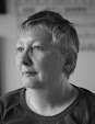
Me with my own book. Photo: Graham White
Last year I participated in the 2012 Sketchbook Project. It took me seven months to fill my wee book before I sent it off in January this year to join thousands of other similar sketchbooks at the Brooklyn Art Library.

Then in April all these books went off on a big tour around the US and every time someone chose to look at your book you'd get an email telling you. It was quite exciting to think that my sketchbook has visited more of the United States than I have.

Now this year's Sketchbook Project tour is drawing to a close and it is currently on show at Canada Water library until next Friday.

The great thing about this is that we live quite close to Canada Water and all we had to do was take a bus to Canary Wharf and then it was one stop on the Jubilee line to Canada Water station and we were there.

They are showing all the books from Europe which meant that we could enjoy browsing through one from Norway all about trees. It was fascinating. We also spent some time looking at one that showed what it is like to travel in a hot air balloon. This was a new perspective on the world to me so this was also a chance to live vicariously through other people.

I was able to look at my own book again and reminisce and put it back in the returns box. (When I got home I had an email telling me that I had taken my own book out of the library which was slightly surreal.)

While I was working on the sketchbook I didn't like the quality of the paper in it and I found it difficult to handle. It was good for me to see how other artists had got round this issue. The trick is to use the pages as a backing for better quality paper, fabric or whatever and then rebind the book. So that's my 'note to self' if I join in this project again in 2014 - rebind it and then I'll probably have more fun.

I'm going to keep my Official Library Card from the Brooklyn Art Library and when I finally visit New York I will take some time out to browse through some more sketchbooks and see what other artists have been up to.


Friday, 5 October 2012

I do like to be beside the seaside

View of the seafront from the Brighton Centre
In the last month or so I have taken up power walking round our local park. This is the closest I've ever got to jogging which I've never seen the point of and have never been attracted to. I've been encouraged to do this in an effort to increase my cardiovascular fitness.

'Yeah, right' was my initial sceptical response to this idea but having started my 30 minute sessions four or five times a week I've found I'm really enjoying it and my fitness has improved already. Although the park stays the same the light varies continually and, this being autumn, the colours of the trees are changing daily too.

Two weeks ago I was due to attend the Liberal Democrat Party conference in Brighton, East Sussex. I was joining my colleagues from Lib Dem HQ for five days of conferring and working. Since I had established my walking regime at home I didn't want to go without my daily walk while we were at the seaside.

View of the seafront from my fourth floor window


So I'd leave the hotel before breakfast and charge along the seafront in the wind and the rain while enjoying the spray on my face from the sea. It's surprising how many other people you meet on these outings who are on bikes, running or taking the dog for a walk so what feels like a solitary experience isn't really at all.

Every day I tried to draw at least one sketch to try and capture the mood of the weather. During our five days it was blustery and frequently raining very hard. As the conference drew to a close the weather improved enormously and I had a chance to walk on the pebbly beach, inhale some sea air and attempt another sketch of the constantly shifting view before heading back to London.

Brighton seafront with the sun out

Saturday, 28 April 2012

2012 Sketchbook project

Photographs: Marta Szabo 2012

Nearly a year ago I signed up to join in with the 2012 Sketchbook Project. A few weeks later I received a small sketchbook in the mail. The deal was that I would explore whatever I wanted to in this wee book and then send it back to the Brooklyn Art Library in January 2012 in time for it to go on the 2012 Sketchbook tour that is now under way.

I loved the idea of being part of an enormous community project that spans the whole globe but starts as something personal and intimate. I chose the theme of 'travel with me' and the title of the book ended up as 'into a world of colour'. I've always been a bit nervous about tackling colour so this was my chance to face down this fear. You can see the sketches online here.
The result is a snap shot of my life over about six months. I explored different mediums and remembered how much I use to like using oil pastel and that watercolour is difficult to handle well. Some of the sketches are considered and some of them are tossed off in a hurry. The quality of the paper was poor which created problems. I did have the option of using my own paper and rebinding the book but I chose to stick with what I was given.

So the sketchbook project began its tour at the Brooklyn Art Library which is where these photos were taken. The next stop is Chicago. Since I live in London I haven't been able to visit the art library myself - I'll have to wait until the tour comes to London in October. So I enlisted my friend Marta Szabo who was very happy to visit and record the event.
Marta is a friend who I have made in the online community. We haven't met in person yet but several years we ago began reading each others blogs which led to commenting on them and then having conversations. Marta is a writer and, with her husband Fred, a teacher of memoir writing which chimes nicely with my own exploration of art.

This association Marta and I have developed reminds me of the book 84 Charing Cross Road by Helene Hanff. Frank Doel was chief buyer at Marks & Co, an antiquarian booksellers in Charing Cross Road in London. Hanff first contacted this shop in 1949 when she was in search of obscure classics and British literature. In time Hanff and Doel developed a friendship which was to last for 20 years and was conducted entirely by mail. Eventually this friendship extended to other staff members in the shop and to gifts being exchanged. Sadly Hanff delayed meeting her English friends until it was too late and Doel died in 1968. Hanff did eventually visit London in 1971 and saw the empty but still standing shop in Charing Cross Road. So that was a bit of a sad ending to that story and I hope I do make a visit to New York before too long so that our story has a different ending.

Saturday, 21 April 2012

Mondrian - Nicholson: in parallel

Last weekend saw us climbing the stairs at the Courtauld Gallery which is a small gallery in the same complex as the much bigger Somerset House. The stairs seemed to go on and on forever and my chest was heaving by the time we got to the top but it was worth it to see this exhibition of Piet Mondrian and Ben Nicholson's work.

I first came across Mondrian's work as a teenager in an art history class at school back in the early '70s. Our teacher was cruising through many artists work that day showing examples on a slide projector. Mondrian was the only one who made an impression on me and I've been fascinated by his work ever since. I went on a sort of pilgrimage around Holland in the early '80s tracking down as many examples of his paintings as I could find on public display in Eindhoven, The Hague, Amsterdam and Rotterdam. So you could call me a fan of his.

I can't possibly do his work justice in this blog, as a very badly presented talk I gave about him at art school would confirm, so if you want to read more about him all I can suggest is you read Frank Elgar's book Mondrian published by Thames and Hudson. This was recommended to me by my head of department, Benno Zehnder as being the best book on the subject.

View from Corbridge. Heather James
My own art work is nothing like Mondrian's, in fact it is more like Ben Nicholson's, but I have always been drawn to Mondrian's very spare compositions of verticals and horizontals on a white background with the occasional use of red, yellow and blue. Looking at his work, for me, is akin to meditating and I am happy to return to it over and over again.

Piet Mondrian and Ben Nicholson met in the 1930s and at the time 'they were the leading forces of abstract art in Europe'. There was a 20 year age difference with Mondrian being the elder and their backgrounds were quite different. Their friendship was so dynamic that Mondrian moved to London in 1938 at Nicholson's invitation where they worked in neighbouring Hampstead studios. It sounds like it was a very productive and creative time for both of them and during this period Nicholson produced his series of white reliefs plus abstract painting.

Mondrian's stay in London was short lived and he moved to New York in 1940. By this time Nicholson and had moved to live in Cornwall with his wife Barbara Hepworth which marked the parting of the ways for these two great abstract artists.

Sunday, 1 April 2012

Drawings by Leonardo da Vinci

We are part of an orderly and polite queue in the Birmingham Museum and Art Gallery. We've been here for about half an hour shuffling forward very slowly towards the door to the print room. It feel like an achievement just to have got here having got up early, travelled by bus from Hackney to Euston Station, collected the train tickets out of a machine and then woolfed down some breakfast, followed by a train ride of more than two hours when we read the Guardian newspaper.

Birmingham isn't the easiest city to navigate as a pedestrian since it seems to have be designed solely for the comfort of car drivers. With a few false starts and meanderings we managed to reach the Art Gallery, which is in an impressive Victorian building, to see Ten Drawings by Leonardo da Vinci from the Royal Collection: an exhibition to celebrate the Diamond Jubilee 2012. And the reason for the rush was that the exhibition was closing the following day and moving on to Bristol.

I was amused that we were queuing behind a family of two parents plus two teenage girls. One of these girls seemed to be verging on adulthood, was good natured and seemed interested in where she was, unlike her sister who was bored with everything apart from her hair.

Since the exhibits were quite small they were displayed in the print room which is self contained with air conditioning and subdued lighting. I felt a buzz of excitement, on entering the room, to be able at last to study the drawings in spite of the sighing and hair tossing that was going on immediately in front of us.

I found it astonishing that I was looking at drawings which had been made roughly 500 years ago and that they were in such good condition. One reason for this is that the paper they are drawn on is made from rags unlike a lot of the paper we use today which is made from trees. So that was lesson number one: use good quality materials which are easier to conserve. Not that I expect any of my drawings to last as long as 500 years.

I was also a bit pop-eyed at the acute level of observation and detail in these drawings and the tiny marks Leonardo used to create them. I imagine he must have used a magnifying glass to see what he was doing, either that or he had exceptional eye sight. While I have seen some of Leonardo's portraits, like the Mona Lisa in Paris and depictions of biblical stories like the version of the Virgin of the Rocks that hangs in the National Gallery I am less aware of his designs for military hardware, cartography and studies of the human anatomy completed at a time when dissecting bodies was illegal. Examples of all of these were on display.

Lesson number two was that I noticed that on more than one of the images Leonardo used a technique of drawing with pen and ink over black chalk on coloured paper. I'm thinking of borrowing this technique but I'll have to develop a level of patience I've never practiced before when creating artwork if I want to achieve anything worthwhile.

Tuesday, 15 November 2011

Tacita Dean: Film

I walked over Hungerford Bridge yesterday because I wanted to get to the south bank of the Thames. I didn't want to stay on the north side with all the traffic and noise.

I'd enjoyed lunch earlier in Soho at the Freelance Media Group's monthly meeting and it was great fun chatting and eating especially as it's held at the Groucho Club. Then I had a quick catch up with my friend who helps runs the group over a cup of tea in a nearby café.

When we parted company what I really wanted was some silence and inactivity. As I walked over Hungerford Bridge a heavy mist settled over the Thames and I could barely see the outlines of office buildings behind St Paul's Cathedral. And with the mist came silence. I turned left at the Festival Hall and walked along the river bank towards Blackfriars Bridge. There were few people around and the Christmas Market stalls, not yet open for business, were being decorated with tinsel and lights. In a few days time I'll be able to buy gingerbread, clothing, bags, notebooks made from recycled paper and more food than I can point a stick at but not yesterday or indeed today.

There was a lone busker singing along to digital music stored on her laptop. It sounded quite pleasant but I walked passed without throwing any change in her cap. There were a few second hand book stalls set up outside the British Film Institute. I had a brief look but didn't feel like lingering and turning any pages.

As I reached the OXO tower a tug sailed by towing a barge with containers, probably full of household waste, in the direction of the Thames estuary. The sound it made boomed across the river and briefly penetrated the silence. I had to leave the Thames Path at Blackfriars Bridge and shortly afterwards I entered the Turbine Hall at Tate Modern.

Tacita Dean's installation Film is on show at the far end of the Turbine Hall. This venue used to be a power station and the Turbine Hall is vast. By the time I'd reached the bench provided for viewers to sit on to watch Film I'd become accustomed to the lack of light. I had to walk slowly and tip-toed around other viewers. We sat in a straight line and it reminded me of monks observing a religious service in the middle of the night. The silence was interrupted by clanging coming from somewhere else in the building.

Tacita Dean is an artist who uses film in a similar way a painter uses paint. Film has sprocket holes, there are 24 frames a second and 16 frames in a 35mm foot. Images can become distorted, the emulsion can get scratched and film is expensive. Stocks of it are becoming increasingly hard to find. In fact some companies have stopped making it altogether because digital recording with its special effects have taken the film industry over.

Apparently Tacita has no time for digital recording preferring instead the subtle nuances of physical film. She labouriously filmed and spliced together this film that lasts 11 minutes, but feels in the darkness a lot longer, a combination of moving and still images and it feels like a homage to traditional film making. She combined footage of waves in water with bubbles and fountains, along with escalators and blocks of colour in primary colours. I quote from her: 'Film is a visual poem. I found its rhythm and metre from the material itself... Film is about film, and in the end, I let the material's intrinsic magic be my guide.'

Having watched this film, which is on a continuous loop, spellbound for more than 11 minutes I left Tate Modern as dusk was falling so it was almost as dark outside as it had been inside. As I walked over the Millennium Bridge towards St Paul's the brightly lit windows of the City of London school and adjacent offices echoed the images I had been watching in Film just a few minutes before.

Friday, 28 October 2011

The Poster King - Edward McKnight Kauffer

In the summer I joined the Islington Arts Society. This was partly to expand my circle of artistic acquaintances and partly to get the opportunity to exhibit my art.

One of the benefits of membership was an invitation on Wednesday evening to visit the Estorick Collection to see the exhibition The Poster King - Edward McKnight Kauffer and listen to a talk by the curator.

The core of the Estorick Collection is work from the Futurist movement and also includes modern Italian art dating from 1895 to the 1950s. Almost the first thing the curator did was to ask a question of himself: What is an artist born in Montana in the United States and settled in England doing on show in a gallery designed to promote Italian art? The answer, which is a bit tenuous, was that Edward McNight Kauffer drew a lot of his inspiration from Fauvism, Vorticism and Constructivism and this includes the work of Italian artists.

I'm familiar with Kauffer's poster designs for the London Underground encouraging passengers to explore the Surrey Hills in their spare time or rush to the Winter Sales or visit the Natural History Museum. I had no idea though that he had been at the forefront of commercial art when it was in its infancy in the early years of the 20th century.

His talent was spotted when a very young man by Joseph E McKnight, a professor at the University of Utah. This man became a benefactor and paid for Kauffer to continue his education in Paris in 1912. As a mark of gratitude Kauffer eventually incorporated his benefactor's surname into his own. At the outbreak of WWI Kauffer had to leave France and made for England and in 1915 received a commission to design posters for London Underground.

There were examples on display of finished artwork for some of the posters which I found fascinating. Having been a graphic design student in the 1970s I could appreciate the labour involved in creating these works. Whereas I recall struggling and failing to create anything worthwhile Kauffer had set the standards for commercial art for the rest of us to follow 60 years before.

Kauffer's heart appeared to lie in the pictorial side of posters rather than the typography. I know to my cost that doing typography well is very difficult to achieve and there are two examples on display where he had to patch over mistakes (I would love to have seen what was underneath).

The work Kauffer did for London Underground led him to receive commissions from various companies and publishing houses. this included work for Shell and BP - by this time the typography was being done by someone else - so Kauffer could concentrate on developing ways of incorporating new technology like photo-montage into his images. By 1925 Kauffer was so famous there was a retrospective exhibition of his work, and he was only 35. He continued being very productive until the outbreak of WWII when, as a US citizen and with commissions becoming scarce, he and his wife returned to live in the US.

It appears he did this with much regret and, although he continued to work, the last decade of his life didn't live up to the success he had enjoyed while settled in England.