Wednesday 19 October 2016

Time for some new designs

I've been selling reproductions of some my art work as greetings cards for 10 years so now seems like a good time to add to my collection. With these two new designs I now have 24 cards for my customers to choose from.

They are blank inside for your own message and cost £3 each and they are on sale in my shop on my website which you can find here.


Tuesday 4 October 2016

A visit to Bletchley Park

The tea room in the visitors centre. I thought this was a good visual metaphor for the grids and patterns that the code breakers were looking for
A comfortable 45 minute train ride from London Euston saw us delivered to Bletchley railway station in bright sunshine followed by a short walk to the entrance to the visitors centre at Bletchley Park. What a contrast this must have been to how members of staff used to arrive at work during WWII when Station X (as it was known) was completely secret.

Now Bletchley Park has its own website but it very nearly didn't survive plans in the early 1990s to be demolished and replaced with a housing estate, petrol station and supermarket. Thanks to the dedication of some well-connected enthusiasts and veterans who had worked there the site has been preserved and allows us, the visitors, to get a glimpse of what it was like slogging away on eight hour shifts breaking the Enigma codes that the German Army and Air force were sending day and night.

In hut 11 the display gives you some idea of the constant noise the WRNS (Women's Royal Naval Service) had to endure not to mention the discomfort of standing up for their whole shift. In huts 3 and 6 where the top secret code breaking took place you can see packets of cigarettes at every desk so the staff must have been working in a fug of fag smoke all day long not to mention worrying about getting the job done which reminds me of working in publishing in the early 1980s.

The results achieved at Bletchley Park due to the perseverance of scholars like Gordon Welchman a fellow at Sydney Sussex College, Cambridge who led the Enigma decryption team and mathematicians including Alan Turing, are credited with shortening WWII by two years which is remarkable. Once the war was over Bletchley Park was shut and all the staff returned to their civilians lives having been instructed never to mention to anyone what they did during the war.

Obviously a visit to this previously secret site feels a bit artificial. Civilians would never have been given access to stroll around the offices, loll about in the canteen or lounge around the gardens any more than we would be able to at MI6 or MI5 now but it does give the visitor some idea how complex the business of preserving a nation's security is which is not something I've ever given much thought to.

Quick pencil sketch of the mansion

Saturday 9 July 2016

Boating lake in oil pastels

Victoria Park West Lake
I've indulged myself and bought a big box of 72 oil pastels. My old ones were all dried up so I threw them out. I wanted to work with a larger range of colours and I've never had so much choice.

Earlier today I braved the blustery wind and strolled into Victoria Park which is right next to where we live and set up my garden chair underneath a tree near the West Lake where they have boats for hire.

I was attempting to try and convey moving water with the boats bobbing around on the surface. I have tried to do this before in a different medium and was reasonably pleased with the results. I think the best approach is not to be too critical of the results and just accept whatever you come up with. I also wanted to include some of the ducks that were busy swimming around but you have to be careful to not make them too big otherwise they can end up looking like the Loch Ness monster.

One of the hazards of working outside, apart from the weather, are the passers-by who might like to offer advice, talk about themselves, or if they are children just make a lot of noise and stare at you. I was fortunate today that I must have been virtually invisible because only two people made any comment and they were polite and undemanding.

This box of pastels are made by Sennelier and they are easy to hold and lovely and oily. I didn't realise until I read the information that they only exist because Pablo Picasso asked Henri Sennelier in 1949 if he could 'create a new medium that had qualities of oil paint and soft pastel in an easy to apply stick form.' So that's a high five to Picasso!

This is part of my view from my chair under the tree


Sunday 3 July 2016

A one day holiday in London


On Saturday we found ourselves unexpectedly wandering around Kensington Gardens. We had no set plans so we followed where our feet took us and they led us to the Serpentine Gallery's Pavillion. It is free to enter and wander around. The construction, which appears to be made from plastic containers but is actually cast in concrete, makes you look through it to the outside where you have just been.

I particularly enjoyed this view of the trees outside. I also enjoyed eavesdropping on a nearby conversation where a family were wondering why some of the cubes were slightly concave and others were not and if the temperature had anything to do with it.


In addition there are a number of summer houses set near Queen Caroline's Temple that have been designed by different architectural practices. These reminded us of an exhibition of Sitooteries that we saw at Belsay Hall, Northumberland back in 2000. You can read a review of it here and see some images of them here.


Tuesday 5 April 2016

Slowly developing my printmaking skills

I am beginning to build a collection of used lino blocks
Since I finished my printmaking course at East London Printmakers in February I've been working on more designs at home. This is far from ideal as I plan my designs and cut the lino upstairs at the top of the house and then print by hand on the kitchen table at the bottom of the house. The good thing about this is that I can work at a time that suits me, I don't have to fit around the demands of other people in a print shop and I can work at my own pace. I'm finding that carving the design into lino is difficult to do well and I hope that my cutting improves over time.

I thought that to start with I would only do single colour prints because that would be easier than trying to register more than one colour on each print. But I quickly forgot about that when I got all excited at the prospect of developing a two-tone duck design based on a sketch I had previously made on an outing to Freightliners Farm in Islington.


Duck near pond at Freightliners Farm
I decided to print it in grey and black which meant I had to be careful about the registration. I'm happy with the contrast of the black, grey and white in this print and I'm pleased that I succeeded in registering some of the prints. But the design is too fussy and I'm not that happy with the quality of the cartridge paper I used. I made the mistake of painting the lino with white acrylic paint so I could see what I was carving more easily and the brush strokes left vertical lines on it that appeared in the final print. This added an element I didn't want and I found that I couldn't remove the lines from the lino.

Lock gate on the Hertford Union canal
For my next print I tried to build on what I'd learned from the previous one. I took more time with my drawing and I tried to be more careful with the carving. This print is of one of the lock gates on the Hertford Union Canal. I liked the idea of laying a blended colour behind the black print. I went ahead and printed that first and then on reflection thought the result was too bright and could have been a lot more subtle. However, I stuck with my plan and printed the line drawing over the top. Of the ten prints I made I only managed to succeed in aligning three of them. I am using water based inks which dry quickly so some of the prints are very patchy and some of the others have been overinked.

I'm already planning my next print design which will be printed in black alone.

Thursday 24 March 2016

Why I hate Tate Modern

Calder's wire sculpture of Medusa was considerably more elegant than I have drawn here
Be warned: I feel a rant coming on. Last Saturday we decided to go on an outing to see the Alexander Calder exhibition. I enjoy an art exhibition as much as the next person but I had to grit my teeth because it is on show at Tate Modern and I do not like this monstrous building. This was my second visit within a few weeks to this vast complex that had been the former Bankside Power Station.

We approached this thing that dominates the skyline by way of the Millennium Bridge, which I very much enjoy walking over, with St Paul's Cathedral behind us. To my dismay I could see an equally hideous extension rearing it's ugly head behind the main museum building that is going to be open to the public from June 2016. I always feel lost as soon as I penetrate the Turbine Hall and can't imagine why anyone thought installing escalators that miss out the first floor was a great idea. It's a bit like inhabiting an Escher painting, once you have arrived at the second floor you have to search for the stairs to traipse back down one floor and inevitably you end up walking past a gift shop. Tate Modern is not so much an art museum but merely a shopping mall with endless corridors, gift shops, cafés, restaurants (and some galleries) all devoted to flogging art in one way, shape or form.

So I was thoroughly grumpy by the time we arrived at floor three and finally entered the exhibition: Alexander Calder, performing sculpture. It occupies 11 rooms in total and my mood improved almost immediately once we were looking at the work we had gone there to see. While photography is banned (the room guards are serious about enforcing this rule) sketching is allowed and I and several other artists were happily engaged making visual notes of different pieces of work and here are some of mine.

It was difficult to draw this accurately because the piece kept changing position in the air current
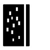
The background on this piece had a number of holes in it that didn't seem to serve any purpose

Calder (1898-1976) used wire to make his sculptures at a time when it was more normal to carve from stone, bronze or wood. He had the advantage of having being raised in a family of artists with his father and grandfather both being sculptors and his mother a painter. He initially trained as a mechanical engineer and only began his art training in 1923 when he began to study at the Art Students League in New York.

His wire figures were like line drawings and his subjects included mythical figures and portraits of his friends including the tennis player Helen Wills, the cabaret star, Josephine Baker and his friends the artist Joan Miró and the composer Edgard Varèse. In 1926 Calder began to build his own miniature circus performers using wire and fabric and then he used these figures to stage live shows in front of small invited audiences who came to see the Cirque Calder.

Calder experimented with controlling the movements of his sculptures by using a small motor. These motors are too fragile to be used now so we have to admire these works as static pieces but there are a few films dotted around the exhibition of some of the works in motion. Since the motors were always at risk of breaking down Calder stopped using them and let his sculptures move on their own as they responded to air currents.

Marchel Duchamp coined the term 'mobiles' in 1931 to describe Calder's moving sculptures and it is a term we still use today to describe the toys that hang from babies' cots. I found the experience of watching these moving sculptures fascinating as they constantly changed position and perhaps that is a subtle legacy that Calder has left our babies while they stare upwards from their cots.

Alexander Calder: Performing Sculpture - on until 3 April 2016


Thursday 25 February 2016

Weeks two and three of linoprinting

Design based on a photo I took on a visit to Freightliners farm
We learned during Week 1 how to cut a design into a piece of lino and print it using an Albion press. During the next two weeks we were given the time to work on a bigger print which we designed and cut at home.

I had taken some photos of the animals on a sketching outing to Freightliners farm last year with the idea that I would develop them into something later on. I discarded the photos of the ducks, fun though they were. I also considered and rejected the cattle, hens and sheep. I settled on the goats. I love goats and I've tried to draw them in the past but they won't stop still and they're either butting each other or sticking their noses in my bag to see what's in there for them.

I chose to concentrate on just one goat and hoped there would be enough to keep the eye interested with the grass in the foreground and the fence posts in the background. I made the print above using a blend of two colours (blue and yellow making green) and I hadn't realised that such an easy technique could be so effective.

So, for Week 3 I was all fired up to develop this design further by printing it in two colours. We'd all been encouraged to cut a second piece of lino (the same size as the first one) and print a ghost print of the design on it as a guide for cutting. I happily cut away at the second piece of lino at home and assumed that I had cut enough away only to find that I needed to remove more lino when I got back to the class.

I wanted to print this in green and black but I felt that I had chosen a green that was too dark so it is difficult to see where it ends and the black begins. However, some people looked at it and liked the fact that it was dark. My teacher also pointed out that I had rolled too much ink onto my lino and you can see the indentations from the lino on the paper. Note to self: use less ink.

You can see there is too much black ink on this print
I think the final print is quite lively and has some kind of atmosphere but I think I've got a way to go before I can consider myself competent. Fortunately you can make lino prints at home without a press so I can practice my technique in the comfort of my own home while I build up my confidence.

I have two books on printmaking that I can recommend. They are: Colour Linocut Printing by Laura Boswell and Relief Printmaking: a manual of techniques by Colin Walklin.

Thursday 28 January 2016

Lino printing for beginners

The Albion Press we used to print our work
I have finally fulfilled one of my ambitions and that is to sign up for a printmaking course this year. I did just enough printing on my foundation course and at art college to whet my appetite but never pursued it when I left college so am now left with no printing skills to speak of.

I've joined a beginners lino printing course at East London Printmakers which is an artists run cooperative near London Fields and,even better, is walking distance from home. Our teacher had us printing our first colour, a yellow block, very quickly having introduced us to the mysteries of registering one colour over another with the use of masking tape.

Yellow printed, now to start cutting the lino
I used for my starting point a wee sketch that I did very quickly while walking on Hadrian's Wall last year. It's one of a series of quick sketches that I made on that walk that I keep revisiting. Our teacher did point out that you can never predict exactly how your print will finally look and how right he was. My original drawing was made in the remote Northumbrian countryside and my final print looked as though it was set in a fair ground! I thought this quite amusing.

Eight of us students managed to produce seven, three colour prints in the course of our first day which we were all quite impressed with. Next Wednesday we'll be working on a single colour design that we will have designed and cut at home during the week.

Trying to register the second colour over the first was not easy
The finished print drying on the rack

Tuesday 19 January 2016

Ice skating at Canary Wharf

Here's my warm-up drawing
I belong to an informal sketching group called Art in the Park and we visited the ice rink at Canary Wharf for our first outing of 2016. This is a temporary structure and we sheltered in the pop-up pub on site called the Tasting Room.

It always takes me a while to settle into drawing so I began with a pencil view of the bar. Then I turned my attention to the outside and the skaters circling the rink. I admired their collective courage - their expertise ranged from terrified novice to fearlessly competent. I quite envied them and briefly considered joining in but decided I was just avoiding trying to sketch the skaters.

First attempt at skaters
Second attempt - thought it was getting a bit repetitive
My fellow artists

Then I thought it might be fun to try drawing without looking at the paper so I tried this with my fellow artists and liked the result. I found it difficult to only look at the subject so compromised by looking at the paper as little as possible. I really liked the way this was going so did one last drawing of a table and chairs using the same approach.

I was happy with the way this drawing turned out and if felt good to take a chance and risk losing control of the final product so while I may not have ventured onto the ice I did step out of my usual drawing 'comfort zone' and reaped some rewards in the process.