Showing posts with label painting. Show all posts
Showing posts with label painting. Show all posts
Thursday, 23 July 2015
Postcards from Canada: 3
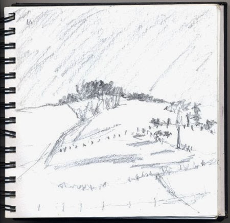
We visited Lakehead University yesterday and while my companions were in a meeting I took the opportunity to sketch this tree. The university is in a rural area and is surrounded by farms and this tree was surrounded by a community garden. Community gardens are flourishing across Canada and in this one they are growing corn, squash and beans following the tradition established by the First Nation farmers.

Saturday, 31 May 2014
Henri Matisse: The cut-outs
 |
| Inspired by my visit to the Matisse exhibition I have tried my own cut-out of a still life |
Matisse devoted the last 17 years of his life to cutting shapes from painted paper and, in spite of health problems impairing his mobility, he was able to produce an enormous amount of work with the help of an assistant. Prior to this visit to Tate Modern my knowledge of Matisse's art was somewhat sketchy. I had thought of him as the artist who produced the Blue Nudes but this exhibition has greatly expanded my awareness of his work.
 |
| Outside Tate Modern |
I was also unprepared for the vast size of some of his work. They occupy entire walls and it takes some time to travel past and absorb the intricate shapes and colours: having done that you need to turn around and walk back to take in more details. They appear to be too large for a domestic setting but some of these designs were commissioned for exactly that purpose.
This exhibition is a riot, and celebration, of colour and shape. This is encapsulated in Room 7 – Vence, The Chapel. If I re-visit this exhibition this room will be the one I return to. I gather Matisse regarded himself as an atheist but that didn't stop him from advising on the design for one stained glass window for the Dominican Chapel of the Rosary in Vence when he was 77 years old. Soon enough he took on the decorative design for the entire chapel, from the windows to the chasuble robes worn by the priests. He ended up turning his studio – and later his bedroom – into a replica chapel so he was immersed in it all the time. Having revised the design for the window a few times Matisse declared he was hugely satisfied with the end result which is both wildly exuberant and spare at the same time. Vence is now on my wish list when we next make a visit to France so I can see the chapel for myself.
Henri Matisse: The Cut-Outs, Tate Modern until 7 September 2014.
Monday, 20 January 2014
The Surrey Hills
 |
| The Weir by the Bridge, Tilford, Surrey – acrylic on paper ©2001 Heather James |
I have to admit though that in one respect it is a bit dull. The terrain is mainly flat until you get up to Hampstead in the north and it is largely built on clay that has a lot of underground springs in it which makes it difficult to dig if you have a garden. There is, however, some interesting common land left to explore on foot that can't be built on. The Surrey Hills on the other hand are quite different. Just south of London there exists this fascinating area largely made from chalk which is designated as an Area of Outstanding Natural Beauty including some areas which are of Special Scientific Interest.
 |
| House in Tilford ©Heather James |
 |
| Waverley Abbey |
While I can never imagine wanting to live in the Surrey Hills many people do and I had a friend who, for a while, rented a converted barn here and the drawing below is the view from there.

Monday, 16 December 2013
Emilio Greco: Sacred and Profane
The Estorick Collection has chosen this year to exhibit Emilio Greco's work to celebrate the centenary of his birth in 1913. This is the first exhibition at the Estorick Collection to be devoted to sculpture but my attention was drawn straight away to his life drawings. They were very confident and full of life and I
felt that they might have been produced just last week. His obvious enjoyment of voluptuous female nudes sets the tone in the first gallery and the accompanying sculptures develop in three dimensions the forms and curves Greco depicts in two dimensions in his drawings.
I was visiting this exhibition along with members from the Islington Art Society and a number of us were very taken with some of the very fine details in his sculptures in particular the eyelashes on one male nude. They appear to be real, fine eyelashes until you look really closely and see they have been made with scratches into the clay before the piece was cast in bronze. This attention to detail along with Greco's awareness of, and artistry in creating solid but alive forms of the human body runs like a thread through the entire exhibition.
Emilio Greco (1913-1995) was born in Catania, Sicily and he began to learn the craft of making sculpture when he was apprenticed as a young teenager to a stone mason and sculptor of funerary monuments. He taught sculpture in Rome, Carrara and Naples and he began receiving recognition for his own work from the 1950s. One of the pieces of work that enhanced his reputation was his design for the Monument to Pinocchio (1953) which is located in Collodi's Pinocchio Park. The design is unlike anything else in this exhibition and was my least favourite exhibit.
Greco was contemporary with Pablo Picasso and you can see Picasso's influence in at least one of his drawings. I really liked this piece and it helped show me that Greco was part of a vibrant European artistic movement where any artist can influence any other. However Greco was also his own man and distinct from other artists and you can see this clearly in the second gallery where there are examples of his sacred work. There are studies for a major project for a set of monumental doors for Orvieto Cathedral which include bas-relief modelling. This project took years to be completed and may well have caused Greco untold anxiety but this sacred work does reveal a depth to this artist which is only hinted at in his smaller nude studies.
Monday, 2 December 2013
Paul Klee: Making Visible
 |
| Vase of pink roses ©Heather James |
Paul Klee (1879-1940) was born near Bern in Switzerland to a German father and a Swiss mother, was given German nationality and lived through turbulent times during his whole life. He was brought up in a musical household and as a young man became a professional violinist. Paul Klee certainly packed a lot into his life which was relatively short but the periods that most interest me are his early life and the 10 year period when he was teaching at the Bauhaus.
His route to studying art was far from straight forward and included being rejected by the Academy of Fine Arts in Munich. Instead of throwing in the towel he studied at a private drawing school and then later on embarked on a six month tour of Italy with his sculptor friend Hermann Haller. On returning to live with his parents in Bern he spent the next four years studying art and experimenting in order to develop his own artistic identity meanwhile supporting himself as an orchestral violinist. It strikes me he must have had a burning desire to explore his interior life as an artist if he was prepared to go to these lengths.
 |
| My view from the sofa when I work in the sitting room |
My apologies for skipping the next 15 years including Klee's service in WWI. We meet Klee in 1921 as he joins the faculty of the Bauhaus school.He begins teaching on the preliminary course and in the bookbinding workshop. Then he is appointed master in the metal workshop and following that the stained glass workshop. Several years later he takes on the textile composition class as well as teaching painting classes. I'm impressed by the range of techniques he could turn his hand to as well as teach. Maybe if he was alive now he'd be designing websites, making art installations and films.
Sadly Klee was diagnosed in 1935 with scleroderma, an incurable degenerative illness which meant he was unable to work. In time his strength improved and he was able to paint again at a steady pace. The final gallery (of 17) in this exhibition has about eight works in it which he produced during the last couple of years of his life. I found these to be among the most moving pieces in the exhibition as I felt drawn, as if by a magnet, into their quiet, colourful interiors where I could have stayed for hours.
Thursday, 31 October 2013
Revisiting old friends
 | |
| View from the churchyard of the Downland Church of the Transfiguration Pyecombe 2008 |
I've had a yen to develop this sketch into a painting for a long time. This morning I dug this sketch book out of the box it's stored in and finally did that painting.
Back in 2008 we spent a couple of days walking part of the South Downs Way which I understand used to be a pilgrim route from Winchester to Eastbourne. It was wet and it was windy but I enjoy recalling the memory of that visit. So here below is the finished result which I will be submitting to the Islington Art Society autumn exhibition next week.
 |
| ©Heather James 2013 |
Friday, 22 February 2013
A bigger splash makes me think
Today I've been lucky enough to spend a few hours socialising with two different friends at two different locations. I met my first friend at En Cas & Espresso café near Old Street where we enjoyed some food and watched snow falling outside.
I met my second friend inside Tate Modern by the bookshop which is next to the Turbine Hall. Since it is often easier to walk round London than go by public transport I made this journey on foot. I walked along City Road until I passed Moorgate Tube station. I wiggled my way round the City until I reached Cheapside then onto Queen Victoria Street, over Millennium Bridge to arrive at the forbidding and fortress-like museum of modern art on the south bank of the Thames where I noticed that the tide was in.
Along the way I dodged traffic and other pedestrians, giving way here and taking the initiative there. Once inside the museum I had to do the same to navigate my way to the bookshop to meet my friend. Then we had to travel on several escalators to finally reach floor four so we could visit A Bigger Splash: Painting after Performance.
There are 13 rooms devoted to this exhibition and the bigger splash refers to the David Hockney (1967) painting in Room One, of a swimming pool with a burst of water as its focal point. On the opposite side of the room there is a Jackson Pollock painting (circa 1950) on display on the floor and on the wall above a documentary showing the artist at work on this same piece. I think I liked this exhibit most out of the whole exhibition.
The first paragraph of the exhibition notes states: "A Bigger Splash: Painting after Performance looks at the dynamic relationship between painting and performance since the 1950s, and at how experiments in performance have expanded the possibilities for contemporary painting."
I confess I don't really understand what this means but we ploughed through every room doing our best to take in what there was to offer. At one point I asked myself: "If I had made this morning's journey covered in wet paint and had someone film me doing it, then shown it on TV in an art gallery would it count as art?" I really was that puzzled.
While I really didn't like watching female models being used as props and some of the images appeared to be quite sadistic I was intrigued by Geta Brătescu's films of her painting her face and then cleaning it all off again. Likewise I enjoyed the Polish artist Edward Krasiński's line of blue tape stuck all around Room Six at a fixed height and watching footage in Room Two of people firing guns at sacs of paint embedded in canvas devised by Niki de Saint Phalle made me laugh.
I found this exhibition very challenging and surprisingly thought provoking which I wasn't expecting when I walked into the first room and by the time we left Tate Modern I noticed that the tide was going out.
Sunday, 14 October 2012
The Sketchbook Project 2012
 |
| Me with my own book. Photo: Graham White |
Then in April all these books went off on a big tour around the US and every time someone chose to look at your book you'd get an email telling you. It was quite exciting to think that my sketchbook has visited more of the United States than I have.
Now this year's Sketchbook Project tour is drawing to a close and it is currently on show at Canada Water library until next Friday.
The great thing about this is that we live quite close to Canada Water and all we had to do was take a bus to Canary Wharf and then it was one stop on the Jubilee line to Canada Water station and we were there.
They are showing all the books from Europe which meant that we could enjoy browsing through one from Norway all about trees. It was fascinating. We also spent some time looking at one that showed what it is like to travel in a hot air balloon. This was a new perspective on the world to me so this was also a chance to live vicariously through other people.
I was able to look at my own book again and reminisce and put it back in the returns box. (When I got home I had an email telling me that I had taken my own book out of the library which was slightly surreal.)
While I was working on the sketchbook I didn't like the quality of the paper in it and I found it difficult to handle. It was good for me to see how other artists had got round this issue. The trick is to use the pages as a backing for better quality paper, fabric or whatever and then rebind the book. So that's my 'note to self' if I join in this project again in 2014 - rebind it and then I'll probably have more fun.
I'm going to keep my Official Library Card from the Brooklyn Art Library and when I finally visit New York I will take some time out to browse through some more sketchbooks and see what other artists have been up to.
Thursday, 27 October 2011
Well rounded cabbages
Saturday saw us at the Tower of London and on Sunday we were swanning around Chichester in West Sussex. What a contrast that was. On Saturday evening my sister-in-law spotted a review in the paper of an exhibition of Edward Burra's paintings at Pallant House and on Sunday morning that is where we headed.
To my shame here is another artist I had never heard of but apparently Edward Burra (1905-1976) was one of the most individual and celebrated artists of the 20th century. Like Tracey Emin's work you find yourself drawn into his paintings even if you find them repellent or menacing.
A lot of his works are very large watercolours using several sheets of paper joined together. I don't think I've seen watercolour paintings this big before with such intensity and depth of colour. According to one of the printed notices on the wall his friends said he would begin painting at the bottom right hand corner and work his way up to the top left hand corner. He had such a fantastic sense of composition and storytelling that you find your eyes going round and round a painting while you explore it to the point of feeling travel sick.
Because of the size of these works I assumed he must have used large brushes. This assumption was crushed when we got a chance to look at some of his brushes and palettes on display in a cabinet. They were tiny! So that made me wonder just how long it took him to complete one piece of work and there was a lot of work on display.
In his youth he was fascinated with the dark side of humanity and it is present in very ordinary looking scenes, for example sailors buying coffee in a café. He uses perspective in an odd way which is disturbing. A lot of the work is sexually ambiguous and he was fascinated with soldiers, sailors and prostitutes and particularly their well rounded behinds. As I moved from one painting to another I got the feeling that these characters were following my every move.
In time Edward Burra turned to still lifes and landscapes. Apparently he had a photographic memory so could recall a view when he was back in his studio. I wish I could do that. One still life depicted well rounded cabbages that recalled the well rounded bottoms of soldiers climbing into a truck in an earlier gallery. He managed to instill menace into these cabbages and I felt they were following me around too! A still life of flowers in a vase appeared to have eyes that followed us around as well.
His depiction of the English landscape was not in the least sentimental and in one showed the pollution being belched out by lorries and motorcycles. Of all his work these were the works I most liked. There was one charming painting he probably made towards the end of his life. It is a collection of portraits of local characters including a self-portrait of him standing away from everyone else eating a Cornish pasty.
Friday, 21 October 2011
Richard of York gave battle in vain
The title of this post is a mnemonic for the continuous spectrum of colours of red, orange, yellow, green, blue indigo and violet and it is also the title of an exhibition curated by Cornelia Parker which is currently showing at the Whitechapel (I think this becoming my favourite art gallery).
I paid my second visit to this show today and before my first visit I must admit that I had never heard of Richard of York gave battle in vain. I would have expected to have run across it at art school but then again I don't recall lectures on colour so maybe that's why I'm learning about it now.
These works are part of the Government Art Collection which totals, according to the booklet listing the pieces, more than 13,500 works of art.That's quite a collection and they are spread across the known world in government buildings and embassies and so on.
Cornelia Parker, whose own work is concerned with collecting and collections, chose to select around 70 works of art and arrange them by colour around the room and hang them in the style of the old Royal Academy exhibition. This means that some of them are hanging very high up indeed near the ceiling, and there is a general feeling of a lack of space. I quite liked this approach.
My favourite image, this time round, is the same as my favourite image from my last visit. Interestingly enough my companions were different on each occasion and we were all in agreement that Graham Crowley's Blue Lane (2003-4 oil on canvas) was a compelling piece of work and we'd have all like to take it home with us.
I enjoyed seeing some works that are hundreds of years old cheek by jowl with contemporary pieces. The drapery on Lady Anne Rich's portrait (1626) was mind boggling but so too was the complexity of Grayson Perry's enormous etching Print for a Politician (2005). I also enjoyed Darren Almond photograph of Flatford @ Fullmoon (2000) and Hamish Fulton's No talking for seven days (1993).
This exhibition is on until 4 December 2011 so I've got time to go and see it again. The following exhibition begins on 16 December 2011 and it's titled Travelling Light and the works, from the Government Art Collection, have been selected by Simon Schama.
Subscribe to:
Posts (Atom)